

Do you ever struggle with which colors to pick when coloring your mandalas? Do you find yourself reaching for the same colors? In this week’s post I share with you an introduction to color design theory.
I personally think it is really cool to see how the colors are mapped out on a color wheel and to see the relationships of colors. In this post, I use the same mandala design throughout to give an easy side-by-side comparison. For your own color study, I recommend drawing a mandala and then scanning and printing copies of it (or hit a photocopy machine). It is fun to see the same design colored in different ways.

Primary Colors
Any study of color begins with the primary colors: red, blue, and yellow. What makes them primary? Well, you can’t create them. No mixing of other colors will produce these three. From these three colors all of the other colors are made. Cool, isn’t it?
The mandala pictured above is colored with the pure hues of red, blue, and yellow. It’s pretty intense, don’t you think? It reminds me of the logos for fast food chains and in other products like the one’s pictured below.

The color scheme is designed to be bold and eye catching. Good qualities for some product images, but it’s not necessarily the feeling that we want from our mandalas.
Don’t write off the primaries just yet.

Using Tints
Here we see how tinting the colors can “tone it down.” When painting, to tint a color use white paint and use gray paint to tone the color. If you are using markers or colored pencils, you may reach for a lighter version of the colors.
Compare and contrast each of these mandalas. The top example uses the pure hue for each of the three colors. In the example in the bottom left mandala, notice how using a light yellow softens the overall feeling. What a difference!
Let’s play with tinting some more. The mandala on the bottom right uses a light yellow and includes a tint of blue along side the pure blue hue. Here we see how many more coloring options we have with just three colors when we add “tints” of the colors.

Secondary Colors
The secondary colors, orange, violet, and green are made by mixing two primary colors.
Orange = Yellow + Red
Violet = Red + Blue
Green = Yellow + Blue

Using Shades
Just as we saw with the primary colors, the secondary colors can be bold and striking when using the pure hue. With the primary color example, we used a tint of some of the colors. Here I used shades (darker version) of violet and green. In painting, shading is achieved by mixing black with the color.
By darkening the violet, notice how the orange looks brighter. Don’t see it? Sit back from the computer and squint your eyes as you look at these two mandalas. Try it!

Inspiration Found in Nature
Nature is an incredible artist. Here is a photo that I took of orange pansies and violets. It’s a perfect example of a secondary color scheme. I sampled the colors from the photo and applied them to the mandala. {{swoon}}

Here we can see a few variations using the same palette of secondary colors. Notice how you can change the look and feel of the mandala depending on which color dominates.

Tertiary Colors
There are six tertiary colors derived from mixing a primary and a secondary color. Notice how the primary and secondary are next to each other on the color wheel to create the tertiary color.
Red-Orange
Red-Violet
Blue-Violet
Blue-Green
Yellow-Green
Yellow-Orange
In the mandalas above you can see how I mixed and matched the various tertiary colors. There is so much fun to be had with these tertiary colors.
But wait there’s more!
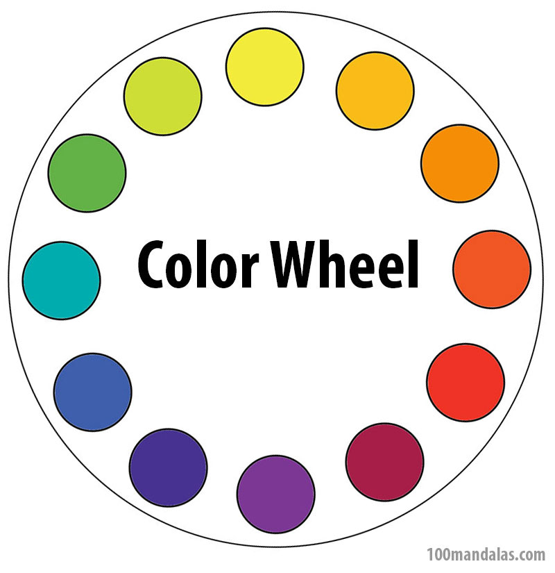
The color wheel is a great road map to exploring different combinations.

In the Color I course you’ll explore these combinations with over sixty examples applied to mandalas in the gorgeous color guide.
You’ll also get access to sixteen videos. It’s a great resource to add to your learning library.

wow, what a wonderful , informative and very inspiring post Kathryn , thank you so much!!!
LikeLike
Thanks Angella. It is truly a pleasure to share what I know. Have fun coloring your mandalas.
LikeLike
Wow! This is the simplest, yet most comprehensive over view of the color wheel.that I’ve ever seen. What a gift! Thank you Kathryn!
LikeLike
Thanks for a great gift 😊
LikeLike
Thanks a lot, this is awesome!
LikeLike
Thank you very much for taking your time and great explanation!!!
LikeLike
I have been pinning paint combinations like yours from Design-Seeds.com on pinterest for some time now! I wanted them for inspiration! I am going to explore the site and start playing with the color in my mandalas! Great idea!
LikeLike
Love the way you presented this, although I’m very familiar with the color wheel …. feel you gave a better grasp. Thank you!
LikeLike
Wow. I am new to coloring Mandalas, this is the best article yet
LikeLike
Thanks! Have you seen my colored pencil video? It is my #1 video for colorists. https://100mandalas.com/2015/11/08/how-to-use-colored-pencils/
LikeLike
It’s starting to come to light on how to use colors together. Thank you for your explanation, it’s pretty simple. When you use seeds and to choose the color pencil to look like the pallet, do you try to just get as close to the color as you can?
LikeLike
I’m so glad you enjoyed this post about color combining. I use a variety of mediums when coloring including markers, pencils, and paint. My favorite is colored pencil and I enjoy blending colors to achieve different tints and variations. Have you seen my video on tips using colored pencils? Here’s a link: https://100mandalas.com/2015/11/08/how-to-use-colored-pencils/
LikeLike
Omg I have been struggling with what colors to use. This will be the answers to my prayer’s. Have seen color wheels before but still never knew how to put it all together to make my pictures pop. Oh can’t Thank you enough for writing this out so if finally makes sense. I am going to write it all out because don’t have a printer. Keep it close by till I get it in my head enough to do it without thinking if it. I have ruinef so many mandalas because didn’t do them right. Wowzie can’t believe it took this long for me finally to get it and wouldn’t have got it without your help. 😃
LikeLike
This post is just a sampling of what you’ll learn in my new color workshop this spring. There will be 10 lessons. The first 5 are all focused on coloring techniques (how to use markers, colored pencils, inktense pencils, watercolor pencils, papers, etc.) the second week builds on what you learned in this post which is all about picking colors for color harmony. This workshop is available to members of the Sharing Circle. I’ll announce when the workshop is release in May in my newsletter. Are you subscribed? https://mandala.leadpages.co/mandala-coloring-book/
Have fun coloring your mandalas.
LikeLike
I love drawing and coloring mandalas. This article is great, helps a lot with picking colors!
LikeLike
This is fantastic. So well explained with examples. Thank you.
LikeLike
You are so welcome! I have a color workshop starting up soon that goes into depth on using markers and other types of pencils. Check it out at http://www.100mandalas.com/color
LikeLike
this does make a lot of sense. I wonder though, how do you know many colors to use when you color a mandala? I have seen 6 pointed and 8 point mandalas and sometimes the lines of demarcation are not so obvious,meaning I have sometimes wondered whether a color goes in a spot or another color goes there instead. Mandalas can be complicated.
LikeLike
I usually pick a palette to work from and then I look at various larger sections and then work down to smaller details. I cover this concept in my online color workshop. It is part of the second week in the series.
LikeLike
saving this link, its great! thank you so much
LikeLike
Excellent!
LikeLike
excellent details of colors i love your site
LikeLike
Thank you. Really appreciate this comprehensive refresher on colour design.
LikeLike
I found you while trying to knit a rainbow colored blanket for my niece. She’s an extra special woman and I want it to be really wonderful. Thank you for sharing! I’ll check out your videos.
LikeLike
Handmade gifts made from the heart are the best! I’m so glad your internet search led you here. Let me know if you have any questions. Even though my color class is geared for mandala enthusiasts, the second part on color harmony is applicable to all mediums. Who knows you may be inspired to try your hand out at creating mandala art to give as gifts. Thanks for taking the time to leave a comment. ~ Kathryn
LikeLike
The color tutorial appears to offer some really good instruction I will be needing. For now, this is the first coloring i have with my PC and many choices of color below the drawing. However I don;t know how to use them. If I select a color, it doesn’t just color a portion that I click on. I guess I need to be able to know how to mix the colors, as well as shading, etc. In addition there are optional features such as a star, flower, etc, If one of those has been clicked, it will imprint on the drawing. I cannot find and direction to follow in using the broad selection of treatments provided. I am obviously a neophyte and need help. If I am writing in the wrong place, please direct me as to when
to go for this information. Thanks so much, Shirley
LikeLike
Hi Shirley, I’m not sure what you are asking or referring to. It sounds like you may be using a color app on your computer. This page offers ideas on how to select colors when coloring mandalas. I use colored pencils, markers and other artist mediums for coloring mandalas. I can’t provide any instruction on using a computer application. Good luck!
LikeLike
have you made anything besides mandalas?
LikeLike
Hi Nathan. Thanks for your question. As you can see from this website the focus is on mandalas. My other website, http://www.truenortharts.com highlights some of my other interests. My favorite medium is working with collage especially as a tool for insight. I am also have a fascination with the Olympic Greek Goddesses and explore those archetypes in a variety of ways. My work lately is influenced by my interest and study of shamanism.
LikeLike
How is your favorite Greek Goddess?
LikeLike
Hey Nathan, I just saw this comment. This week we are working with Aphrodite. She is sooo lovely and awakens the best in each of us. It is always good to have a muse who reminds us that beauty is everywhere. She says, “hi!”
LikeLike
This is great! Thank you!
LikeLike